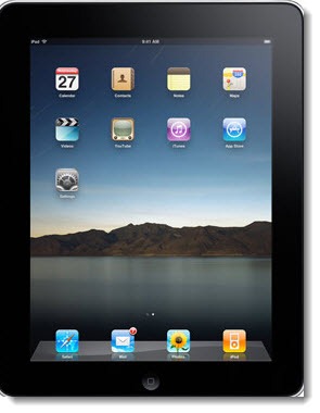
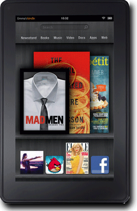
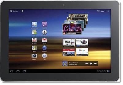
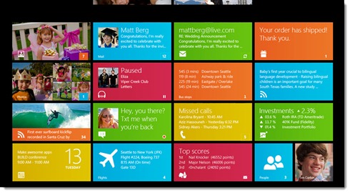
Here are representative screen shots of what tablets present and future look like side by side.
Apple iPad 2

Samsung Galaxy Tab 10.1
(standing in for all the Android tablets)
Amazon Kindle Fire

Microsoft Windows 8
(a preview look at Microsoft’s tablet interface)
Mary-Jo Foley makes an important point:
Obviously, buying choices aren’t entirely based on just one factor. It’s not just the user interface that is the ultimate differentiator. Price, apps, usage plans, device weight, battery life, overall look and feel and many more factors matter, too. And we don’t know enough about Windows 8 — beyond the user interface and legacy app support plans — to truly evaluate it against the existing and coming competition.
I find the iPad, the Samsung, and the Kindle Fire interfaces to be very appealing. The Apple and Android tablets are obviously oriented toward individual apps; the Amazon tablet is just as obviously focused on consuming media provided by Amazon.
As a personal observation, just my own taste, nothing you have to agree with – I hate the Windows Metro interface as a home screen. It’s being used on Windows Phones already and Microsoft is planning to make it the default for computer versions of Windows 8 in addition to tablets.
Metro works well as a design for individual programs and apps. Here’s a designer who took screen shots of programs and put them next to photos of various real world signs that look Metro-ish. Nice.
But as a home screen? Yuck. When I stand back and unfocus my eyes, it’s unappealing. When I study it up close (click on the picture above and look at the enlarged version), it’s cluttered and ugly as sin. I know all the arguments – lots of information presented efficiently, blah blah. Don’t care. Don’t like it.


For a tablet, I would prefer Metro to Aero for a touch interface and for a home screen. For a non-touch interface Aero is my preference. But that is why Microsoft is giving you the choice. Windows 8 has both Metro and an enhanced Aero. They know Aero could not be dumped. You want a Desktop, you can have a desktop.
But I have been using the Rainmeter Metro-style interface on my HP touch tablet for months and can hardly wait for the real thing.
With respects to Mary-Jo, anyone interested ought to look at
“Building Windows 8” at http://blogs.msdn.com/b/b8/rss.aspx.